Grundingen
Updated graphic profile, web & web design
Grundingen develops one of Sweden’s most attractive real estate portfolios and builds homes in some of the country’s best locations.
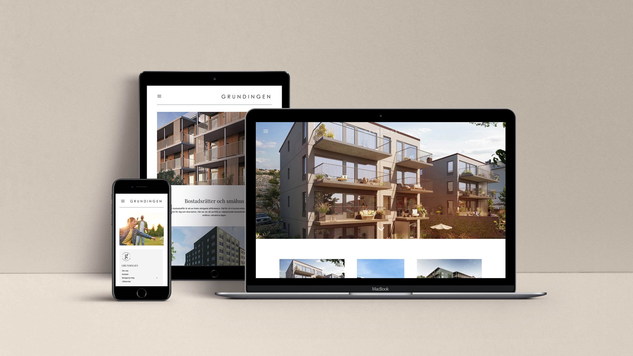
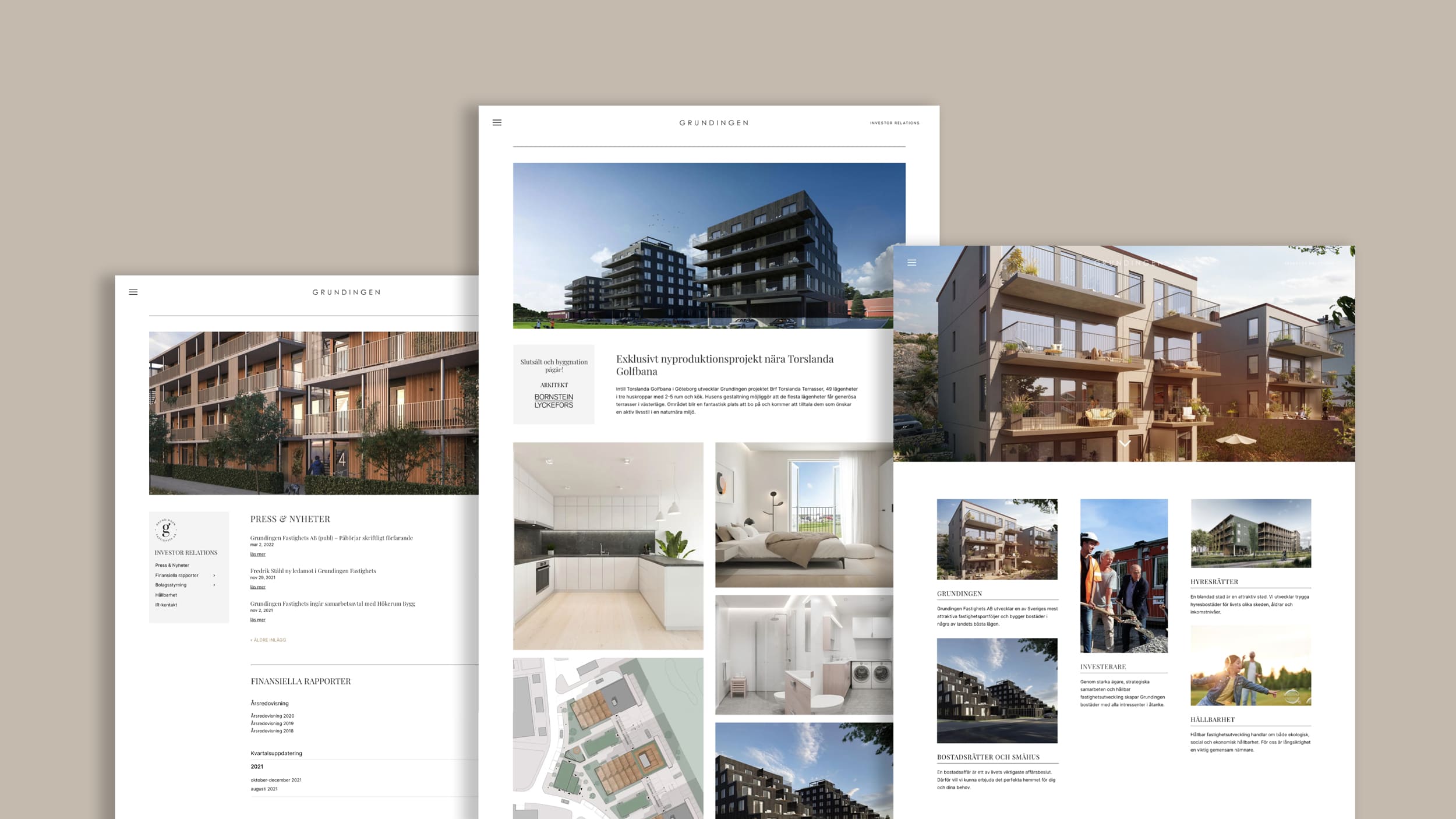
Together we have updated their graphic profile and developed a new website. It resulted in a stylish, elegant and timeless profile that applied excellently to the new web. The new profile is updated with a new logo, font, symbol, colors and image styles. Take a peek below!
Visit Grundingen’s website HERE.
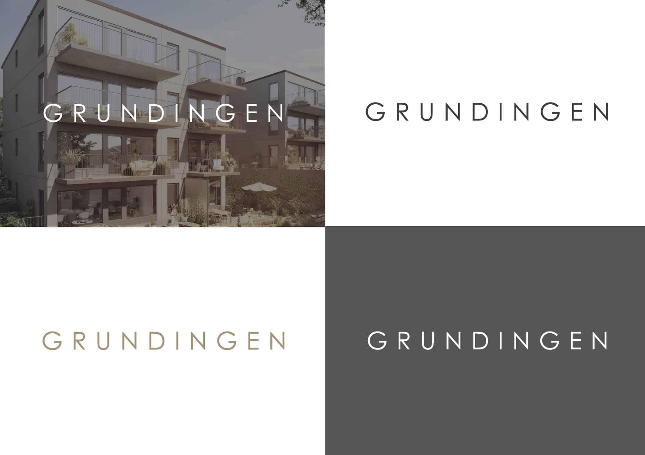
Logotype
Use
The logo is used primarily in 85% black or 100% white. We use the black logo to advantage against white, light gray, and light image backgrounds. We use the white logo against darker backgrounds and dark image areas. Secondarily, if necessary, the bronze-colored logo is used.

Symbol
Use
A symbol for Grundingen is also available.
The symbol should be used sparingly on both web and profile material. Used as a value-adding quality stamp / sender signature that means that Grundingen is behind the material.
Colors
Primary colors
The primary colors of the primer are Bronze, Platinum Gray, Foggy white and White Dream. These colors must be used in all communication. When developing units with single sides, not all primary colors need to be used. For larger units, all primary colors may be included if it is used sensibly. It is important that the colors create harmony rather than just decoration.
Secondary colors
The secondary colors of the primer are Dark Charcoal Silver Gray and Sky Gray. These colors complement the primary colors and should be used sparingly. Used mainly in the footer, icons, quotes, information graphics and other supporting graphics / typography.
Fonts
Website

